
blog
ALL | ABOUT MY WORK | EVERYTHING ELSE
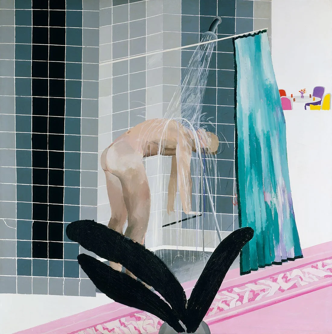
DAVID HOCKNEY: A LIFE PROPERLY FRAMED
I grew up with David Hockney.
Not literally. I never knew him. But his work appeared at regular intervals throughout my life as a painter, and each time it seemed that he had gone off somewhere I hadn’t expected.
When I first became aware of him, it was through his portraits, drawings, and paintings of flowers. I was struck by the fact that he was so unapologetically representational at a moment when so much of the contemporary painting around me seemed to be heading in the opposite direction. I wasn’t quite sure what to make of him. In my mind, he sat somewhere between Matisse and Fairfield Porter. There was Matisse’s flattening of space and pleasure in color, but also something of Porter’s conviction that the world immediately around you, your friends, your rooms, the flowers on the table, was sufficient material for serious painting.

THE COUNCIL OF TEN: SECRECY, SURVEILLANCE AND PUNISHMENT IN VENICE
Venice had a complicated system of government. Power was distributed among councils, committees and elected officials, all carefully arranged to prevent any one person from taking control.
Then, in 1310, a group of Venetian noblemen tried to overthrow it.
The conspiracy failed, but it frightened the ruling class badly enough that they created a special committee to investigate what had happened and make certain it did not happen again. It was called the Council of Ten because ten patricians were elected to serve on it. The name was slightly misleading. The doge and his six councillors also attended its meetings, making seventeen men in the room before any additional members were called in.
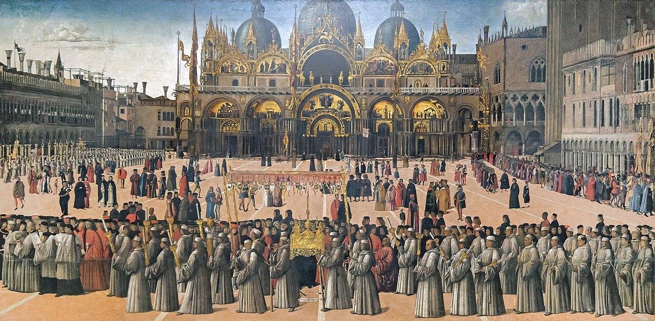
WHO REALLY RAN VENICE?
There is something misleading about the word republic.
When we hear it, we tend to imagine citizens choosing their leaders. Venice certainly had citizens, and it was fiercely proud of not having a king. But during the years of Jacopo, Gentile and Giovanni Bellini, political power belonged to a relatively small group of hereditary patrician families. If you were born into one of those families, you had a place in the government. If you were not, wealth, talent and fame might bring you very close to power, but they would not give you a vote.
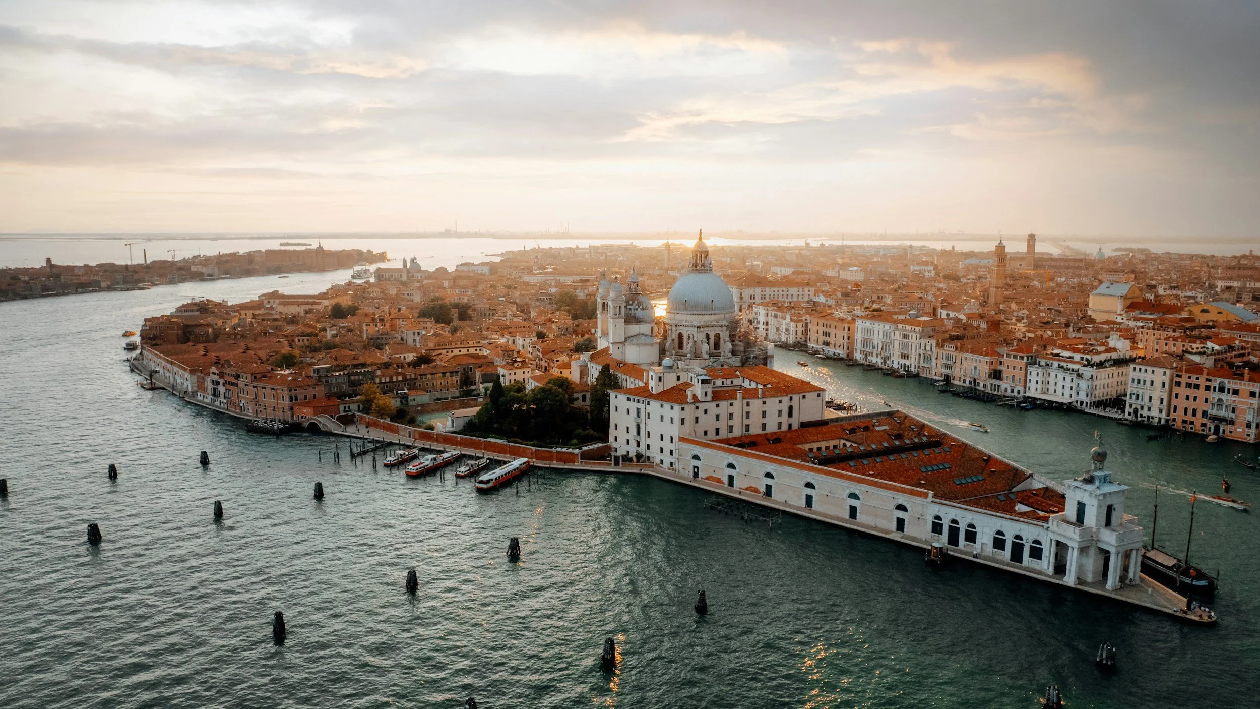
VENICE: AN IMPOSSIBLE CITY
At first glance, Venice is an absurd place to build a city. There is almost no firm ground. The islands are low, muddy, and divided by tidal channels. The water is salt. Stone, timber, grain, fuel, and drinking water all have to come from somewhere else. A sensible person might have moved a few miles inland.
The people who became Venetians did the opposite.
By the time of the Bellinis, this unlikely settlement had become one of Europe's wealthiest and most powerful cities. It had spread across scores of small islands and commanded an extensive maritime empire. Venice prospered not despite the lagoon, but because of it. The same water that made the city difficult to build also made it difficult to attack. It connected Venice to the Adriatic and the eastern Mediterranean while keeping it just beyond the easy reach of mainland rulers.
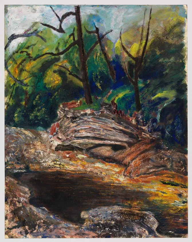
CARL RUGGLES - ARTIST, COMPOSER AND NEIGHBOR
Carl Ruggles lived and worked in a weather-worn one-room schoolhouse in Arlington, Vermont, where he spent every morning chiseling dissonant counterpoint and every afternoon pouring color onto paper. This post visits his twin legacies: the explosive watercolors “Trumpet Flower” (1940) and “The Pool, Roaring Branch” (1932) that pulse like Vermont’s Batten Kill, and the sixteen granite-hard musical scores—Sun-Treader, Men and Mountains, and more—that made him a cult hero of American modernism. Along the way we hear composer Henry Brant’s first-hand tale of finding Ruggles hammering a single piano key “to make sure it’s a good note,” and we trace how the local Roaring Branch stream fed both his pigments and his brass chords. Whether you’re hiking School Street for a glimpse of Ruggles’s old studio or spinning Sun-Treader to rattle your speakers, you’ll discover why this Arlington neighbor still matters to painters, musicians, and anyone who prizes art made the slow, stubborn way—one bold color, one uncompromising note at a time.
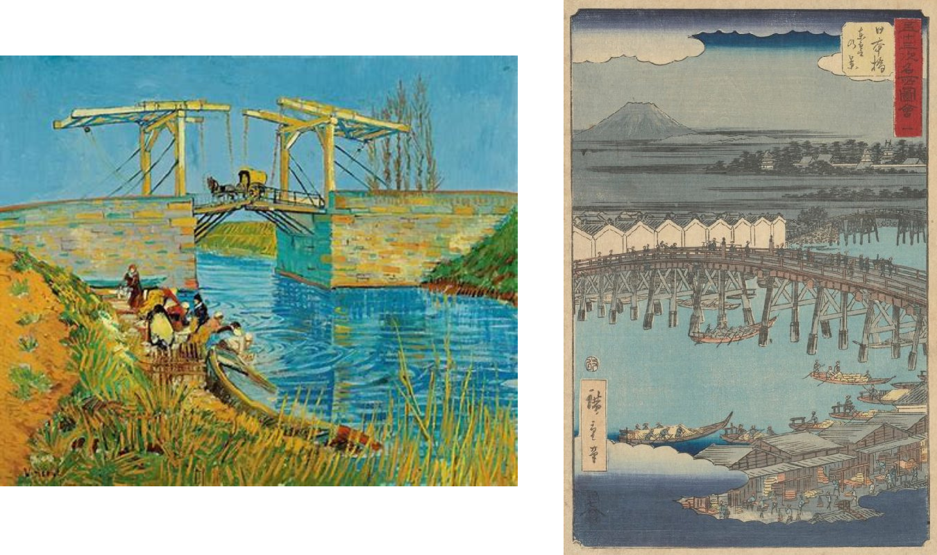
LE JAPON ARTISTIQUE: THE MAGAZINE THAT CARRIED JAPAN INTO THE HEART OF EUROPE
When Siegfried Bing launched Le Japon Artistique in 1888, he wasn’t merely publishing a magazine — he was setting fire to the imaginations of Europe's artists, designers, and dreamers. Over its three transformative years in print, this elegant publication didn’t just spread images of Japanese art across Europe; it rewired the very way artists thought about space, form, and nature. Through its pages, Japonism didn’t remain a trend — it became a revolution.
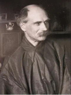
SIEGFRIED BING AND THE RISE OF JAPONISM IN FRANCE: The Man Who Brought Japan to Paris
Siegfried Bing and the Rise of Japonism in France: The Man Who Brought Japan to Paris
When we think of the Impressionists — Monet, Degas, Van Gogh — we often picture solitary geniuses revolutionizing the art world with bold colors and radical brushstrokes. But behind their innovations stood a key figure: Siegfried Bing, the art dealer whose passion for Japanese art transformed 19th-century Paris and sparked the Japonisme movement that reshaped Western aesthetics.
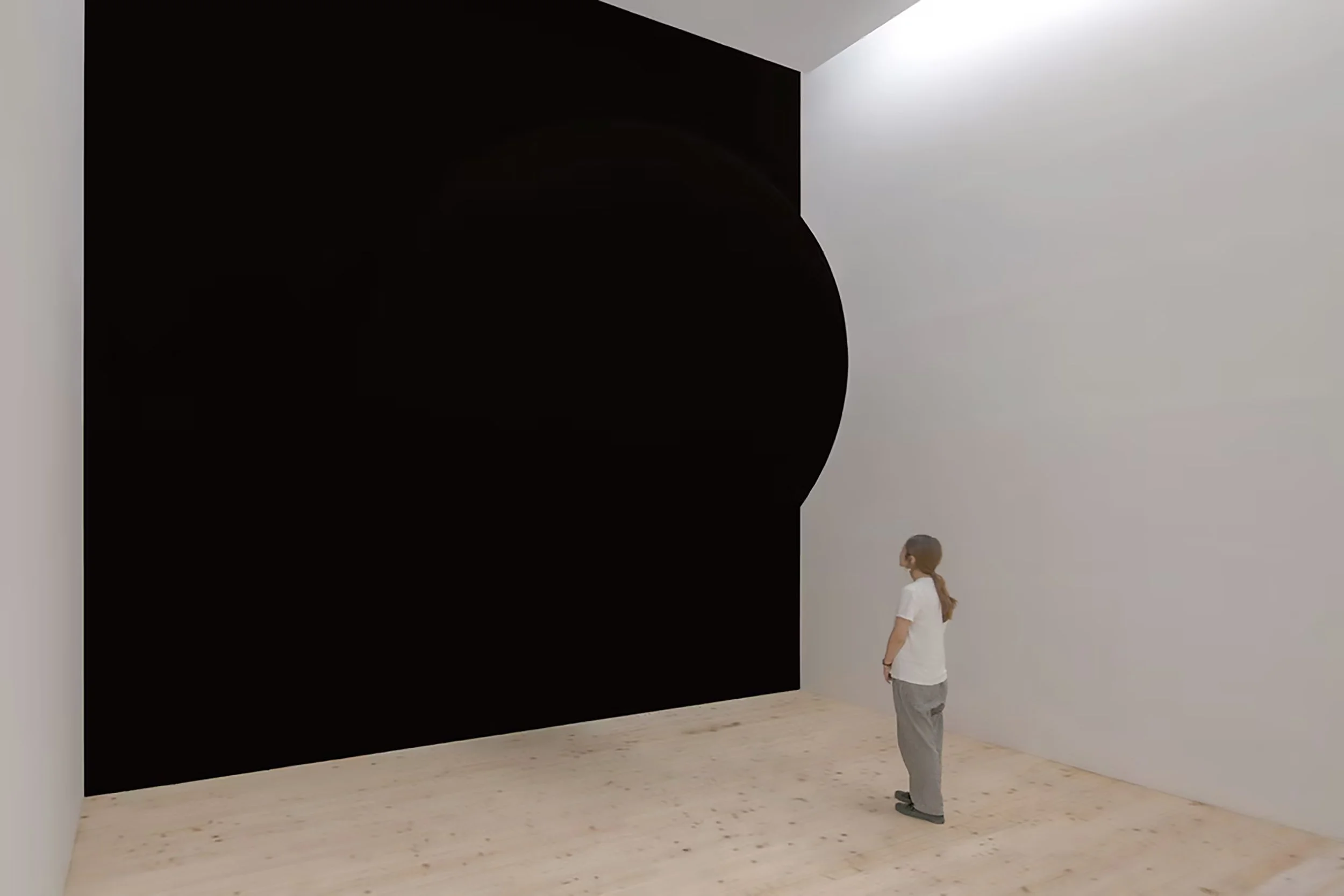
BLACKER THAN BLACK: ANISH KAPOOR AND THE DISAPPEARING OBJECT
Some time ago I wrote a very short blog post called Having Sex with Artists. I had dreamed that I had sex with Frank Stella under a boardwalk on Fire Island. Not long after that, Anish Kapoor turned up in another dream, this time courting me.
Harold Bloom called it the anxiety of influence. I called it having sex with artists.
Apparently Kapoor had already made his way into my subconscious.
Now that I have been looking at black paintings, I have a more respectable reason to think about him.

PIERRE SOULAGES: LIGHT REVEALED BY BLACK
Pierre Soulages is the artist I think of first when I think of black paintings.
I have seen his work in several settings over the years, and I remember being overwhelmed at first by the blackness. It dampened my spirit. I don’t know quite how else to put it. There was simply too much black.
And then, almost despite myself, I began to see the light.
It caught the edge of a ridge of paint. Then another. A streak appeared where a tool had dragged through the surface. As I moved, the light moved with me. I could suddenly see that Soulages was drawing with light.
The black wasn’t there to create a void. It was there to give the light something to catch on.
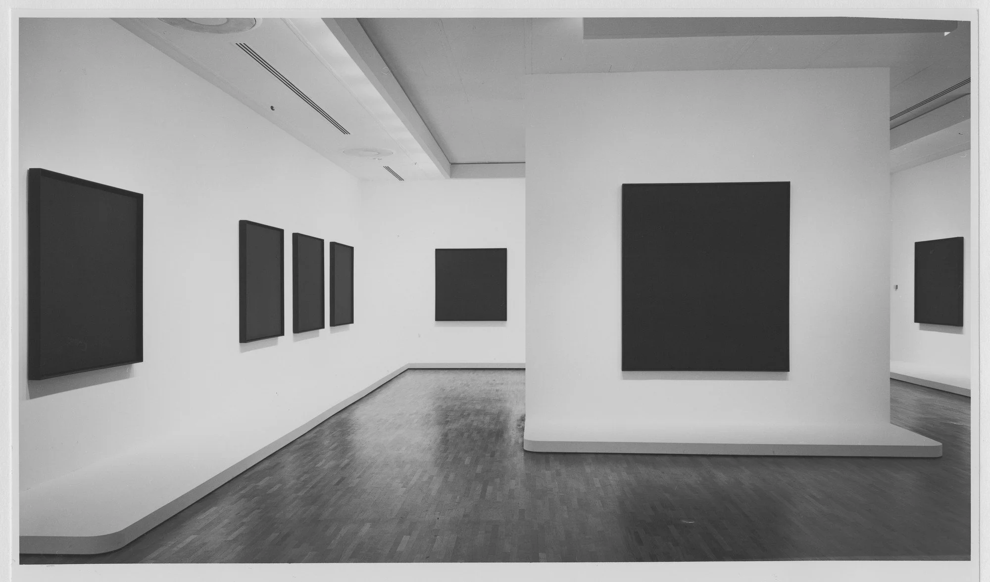
AD REINHARDT: HIDDEN IN PLAIN SIGHT
When I was a child, I took art lessons at the Museum of Modern Art. After class I would go through the collection. I did this every week, so certain paintings became almost like acquaintances.
I remember the first time I came across one of Ad Reinhardt’s black paintings. My first reaction was more or less: WTF.
I can’t remember now for sure, but there may have been a Larry Bell box nearby and possibly a white painting by Robert Ryman. I may be telescoping different visits. Bell’s glass box, which glistened like a gas leak, was a helpful comparison. It had already made me alert to the surface. Reinhardt’s painting seemed to be doing something entirely different.
So what was it?
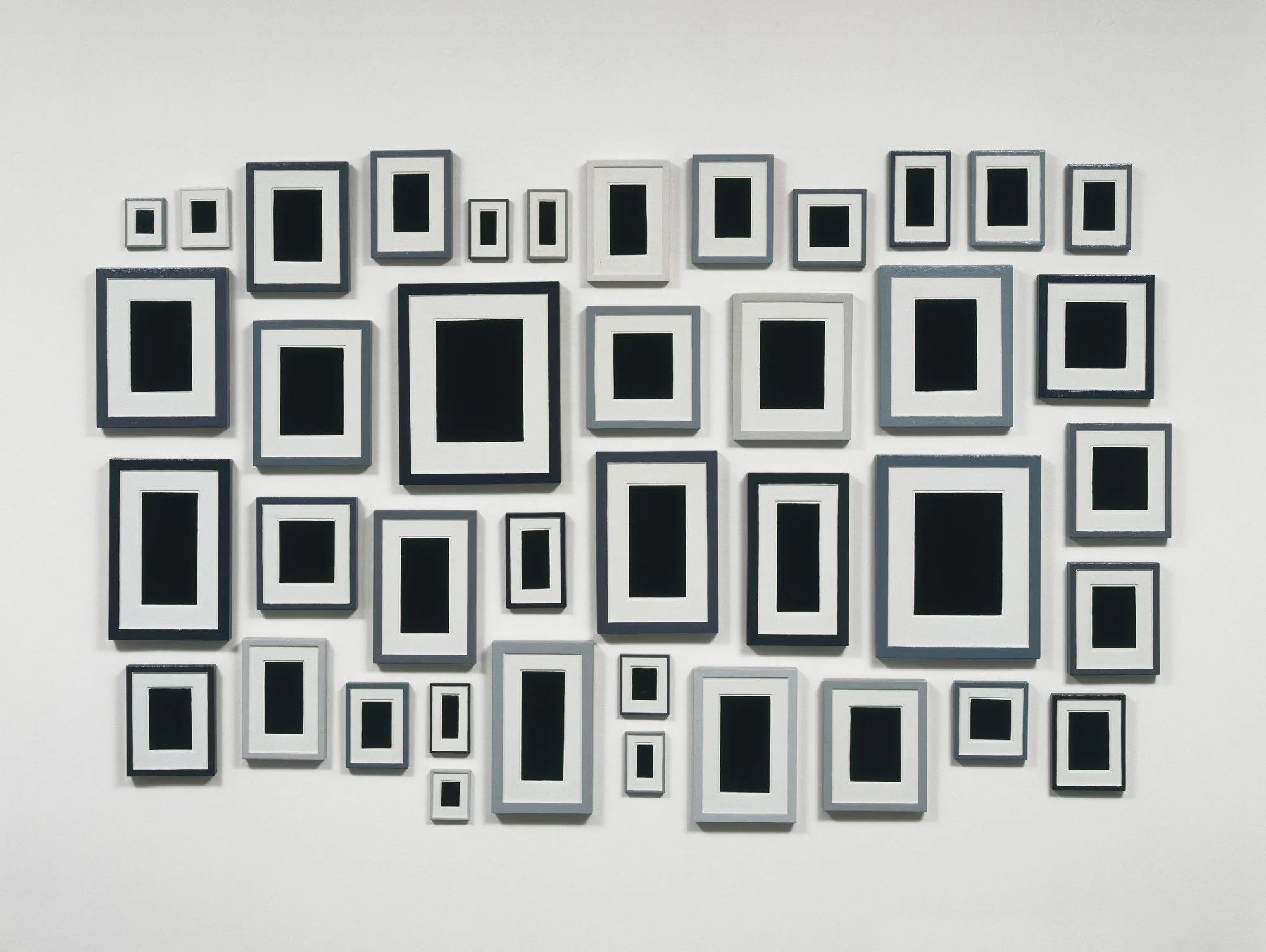
ALLAN McCOLLUM: WHAT ARE WE LOOKING AT?
The first time I saw Allan McCollum’s Surrogate Paintings, I thought they were totally cynical.
As I looked at them, what I thought I was seeing was a black painting, matted in white and put into a brown frame. The painting was nondescript other than its color. The mat was ordinary white, not what I would have thought of as museum quality, and the frames looked as though they might have been bought at a rummage sale.
But what they actually were was something else.
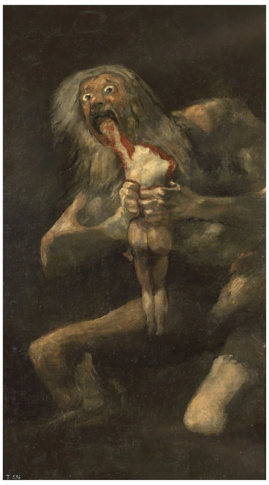
GOYA: LIVING INSIDE THE BLACK PAINTINGS
Goya's Black Paintings were not his first encounter with black.
Years before he painted those extraordinary images on the walls of his house outside Madrid, black had already carried the weight of The Disasters of War, the print series he began during the Peninsular War. They are some of the most horrifying images of war ever made. Bodies are mutilated. People are hanged. Women are attacked. Families flee. People starve. There are no heroic generals on horseback, no glorious battles, no suggestion that war ennobles anyone.

BLACK IS BLACK—UNTIL IT’S NOT: Malevich’s “Black Square”
Years ago, I took my “steppish” daughter to the Guggenheim. I never married her father, hence the qualification, but she has been in my life since she was a child.
We wandered into a side gallery that held several paintings by Kazimir Malevich. I don’t think I had taken twenty steps before she began peppering me with questions. Did Malevich know Picasso’s work? What other artists did he know about? Had he seen Duchamp? Was this before or after the Russian Revolution?
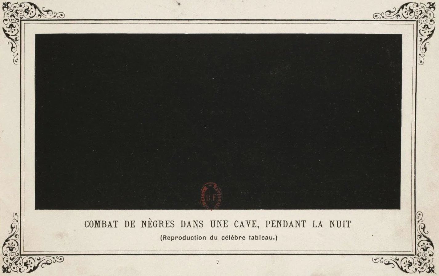
THE FIRST BLACK PAINTING WAS A JOKE
When we think of a black painting, we tend to think of something serious. Malevich. Ad Reinhardt. Rothko. Soulages. Black as emptiness, infinity, death, light, transcendence.
But one of the earliest black monochromes was a joke.
In 1882, the French playwright and poet Paul Bilhaud exhibited a small canvas painted entirely black in the first exhibition of the Arts Incohérents, a wonderfully irreverent group organized by the writer and publisher Jules Lévy. The Incohérents had no interest in behaving themselves. Their exhibitions were conceived partly as a parody of the official Salon, and included visual puns, altered objects, parodies of famous works and pictures made by people who supposedly did not know how to draw. As the Musée d’Orsay rather nicely puts it, for the Incohérents, “seriousness” was the enemy. (Musée d'Orsay)

GENE DAVIS: PLAYING COLOR BY EYE
I had assumed that Gene Davis made nothing but stripe paintings. He did not. He began with drawings and Abstract Expressionist paintings and later made collages, micro-paintings, video, neon, and enormous outdoor works. But once he found the stripe in the late 1950s, it became his principal subject.
Subject is the word Davis himself used.
“I have very, very strong subject matter in my work, which is stripes,” he said. “A stripe is just as real as a goddamn flower.”
That gets us closer to the paintings. The stripe was not simply a device for arranging color. It was the thing itself.

KEN NOLAND: WHEN COLOR MET COLOR
When I was a student at Bennington College, Kenneth Noland lived a few miles away in Shaftsbury, Vermont. He had nothing officially to do with the college while I was an undergraduate, but his presence was felt. Artists and critics who came to see him would sometimes turn up at Bennington—Larry Poons, Tony Caro, Clement Greenberg.
When I became a graduate student, Noland taught a course that I took. He was surprisingly practical. He talked about how we arranged our studios and how we dealt with all the things that pulled us away from the work. He was interested in the circumstances of being an artist: how you set things up so that you could keep painting.
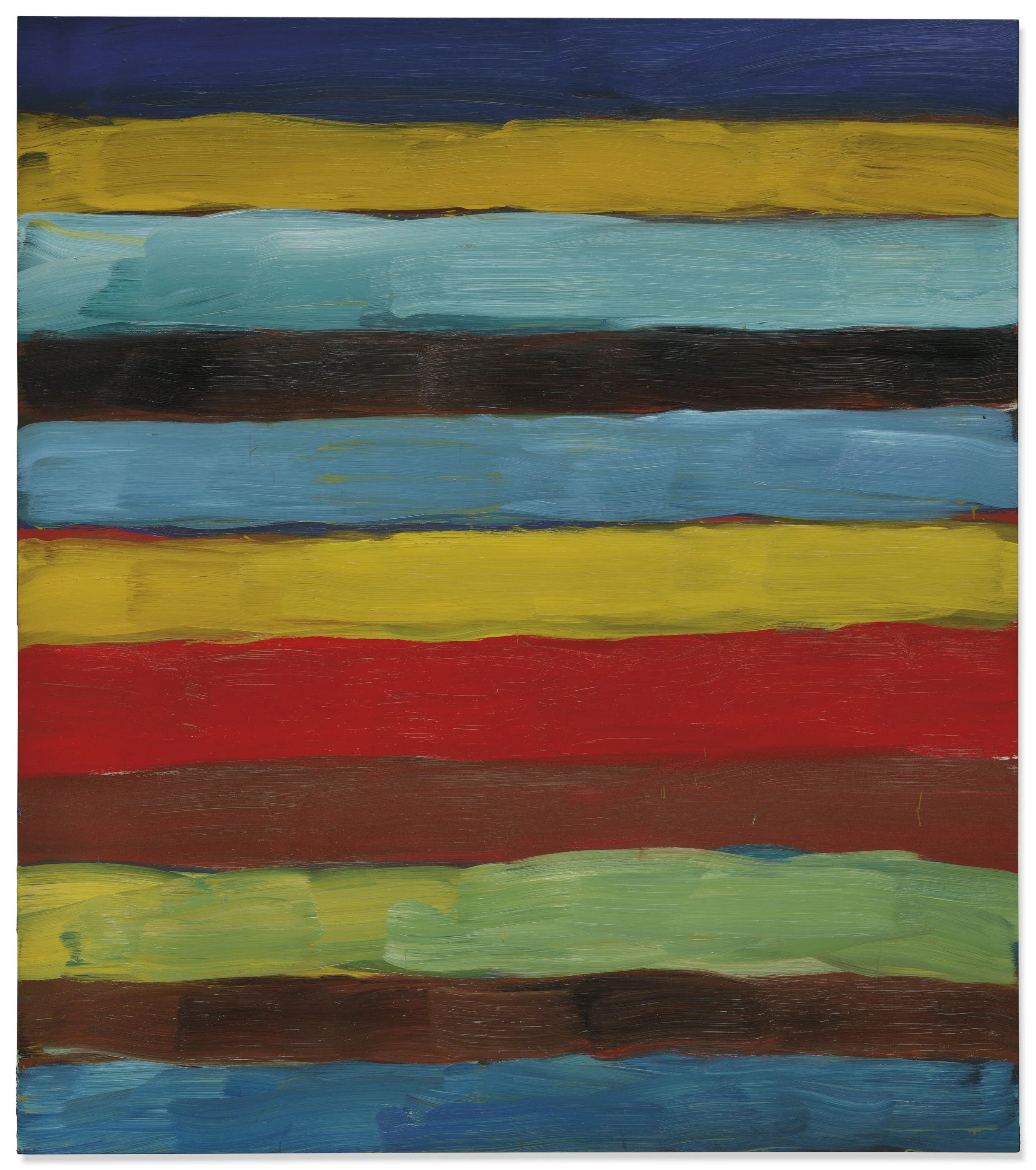
SEAN SCULLY AND THE PAINTED STRIPE
Frank Stella did not arrive at the stripe because he liked stripes.
He arrived at it because he was trying to solve a problem in painting.

GERHARD RICHTER: THE REALITY OF PAINTING
Frank Stella did not arrive at the stripe because he liked stripes.
He arrived at it because he was trying to solve a problem in painting.